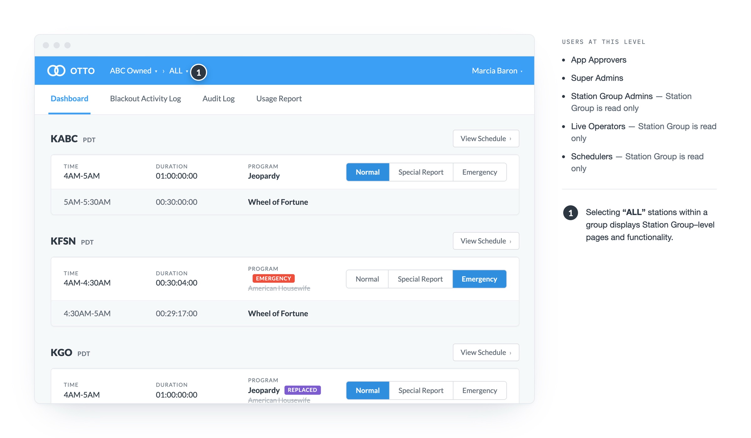
Scheduling portal built for broadcast
A systematic UX overhaul of the internal scheduling portal at the heart of ABC's national broadcast operations.
Overview
OTTO is the internal scheduling portal used by more than 200 ABC owned and affiliated stations. Station teams use it to view network schedules, replace non-rights-cleared content, switch to emergency content, and distribute the resulting stream to Digital MVPDs. It had gone more than a year without a dedicated designer.
The problem
The app was functional but fractured. Months of adding features had created navigation that no longer matched how users worked, turning routine tasks into multi-step ordeals. I developed an improvement plan, pitched it to management, and got buy-in to move forward.
Research & strategy
I kicked off with a heuristic evaluation, documenting findings and prioritizing issues for the team. Moderated usability testing followed, surfacing four clear areas for improvement: information architecture and navigation, status indicators and system feedback, UI consistency, and content strategy.
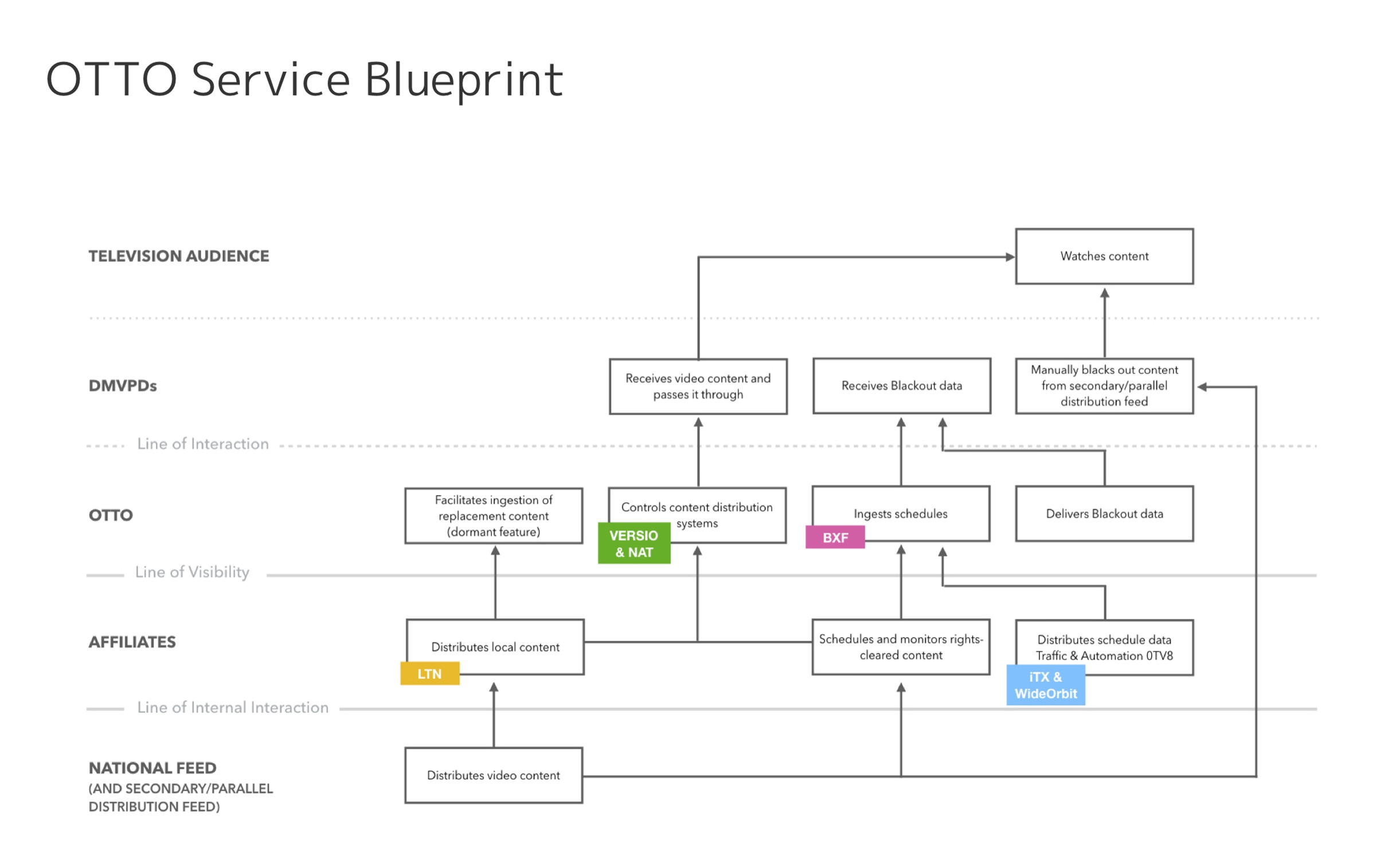
I also partnered with the lead developer to create a service blueprint, giving the team a shared view of OTTO's role in the broader ecosystem.
Consistency & enhancements
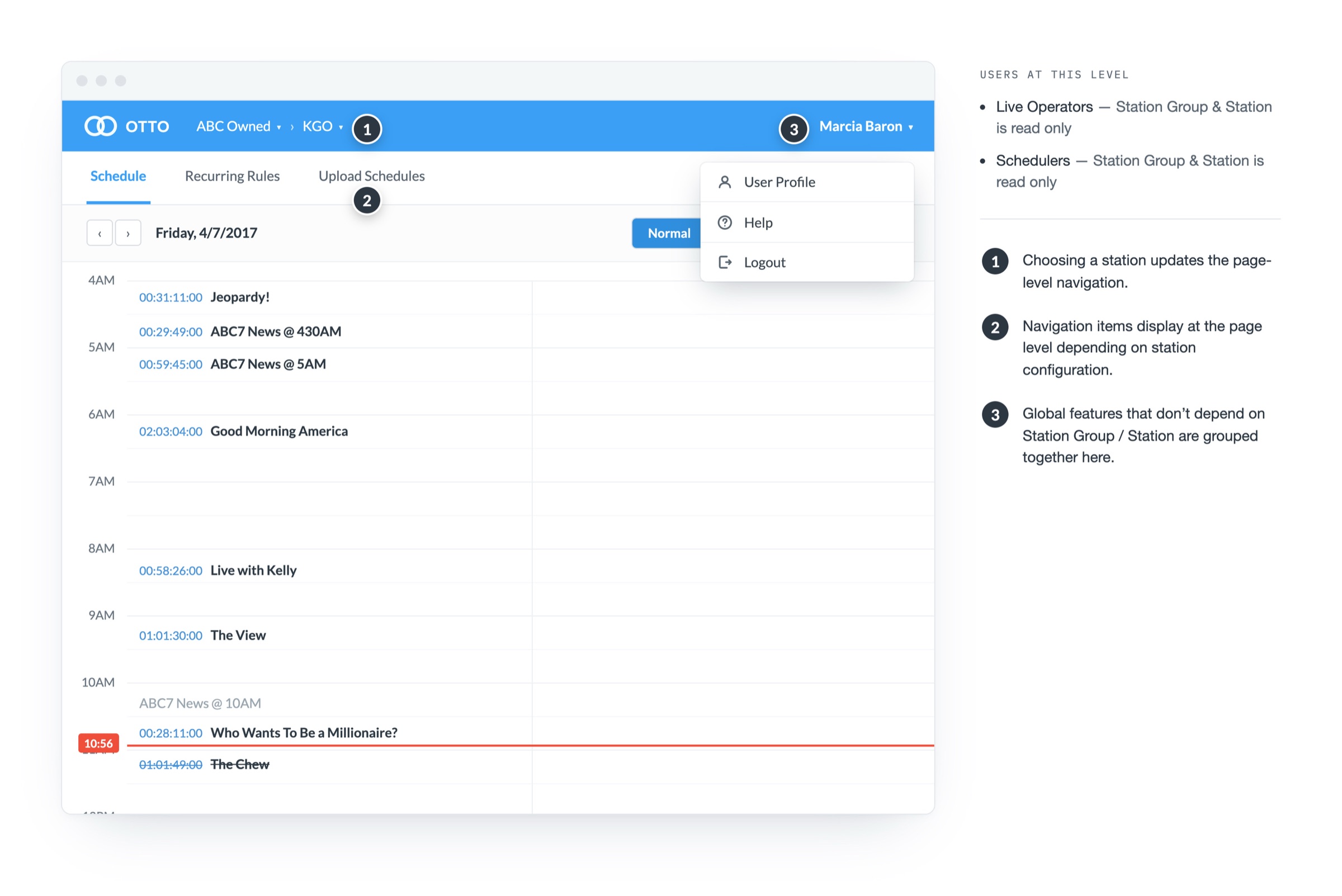
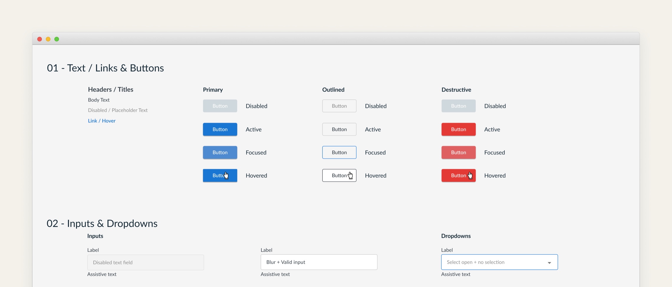
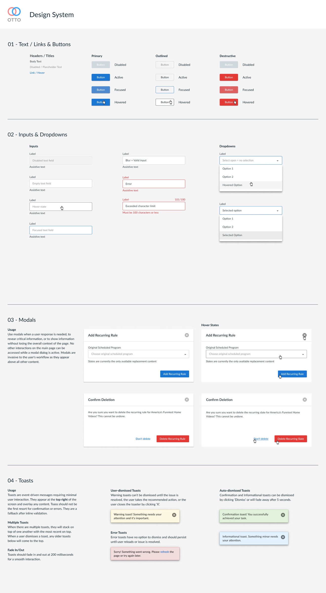
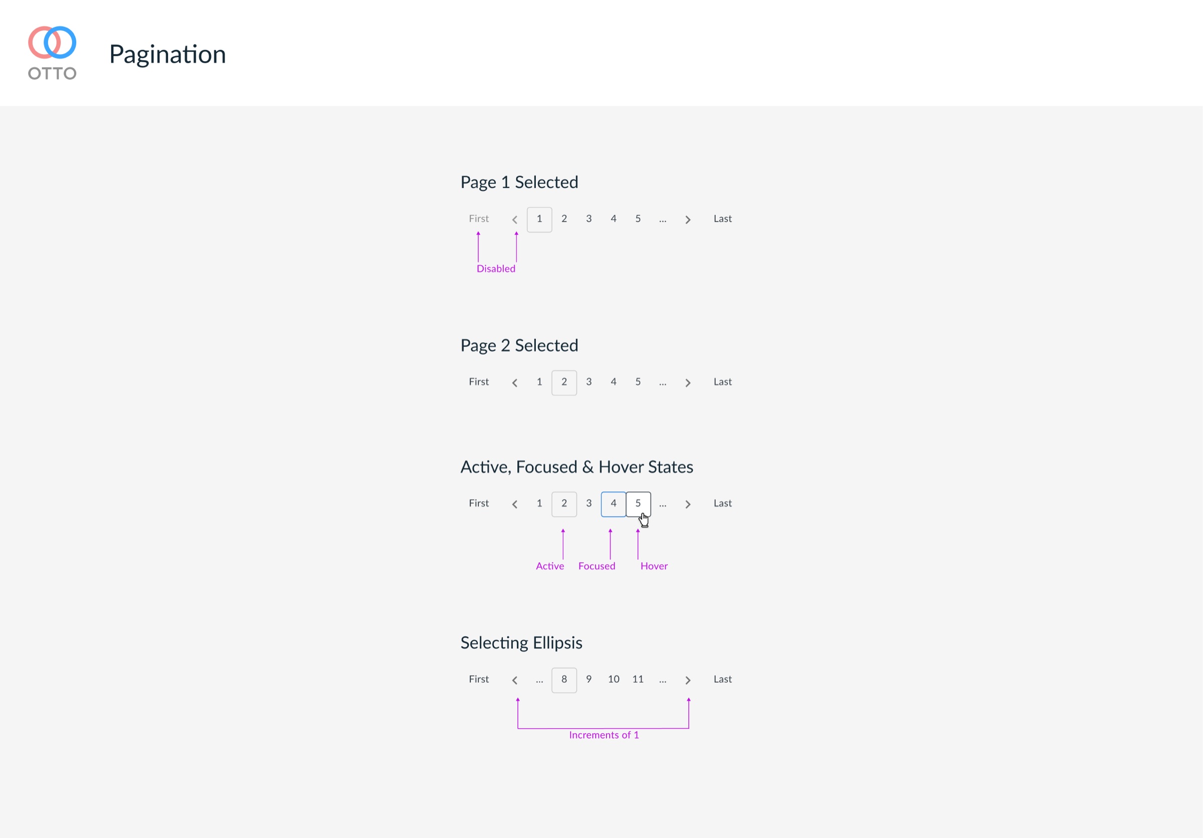
I built a design system with reusable components, working closely with the dev team through implementation. Navigation was the top frustration in testing: the structure was disorienting and unclear. I redesigned the page structure and delivered annotated designs for review across dev, product, and management.
The outcome
After over six months working toward improved usability and user satisfaction, OTTO is thriving. The tool is the first of its kind and has been nominated for an award for internal digital products at Disney.